Wednesday, October 29, 2014

ANNOUNCEMENT. THIS BLOG IS CLOSING

Hello to all.  I just wanted to let you know that I am closing this blog and have opened another.  It can be found at I am working towards simplifying my life, my designs and my overall approach towards scrapping. I started this craft to leave the legacy of our story to future generations. What I realized is that I had a lot of pictures, but not a lot of story.  So, I am going to blog, scrap and post with the intent of speaking to those present and future family members. I guess I just want more meaning to what I am doing.

The new site has a cleaner design, It is simply the craft and the story in a magazine style.  I am to use it as a place keeper for m thoughts and impressions that I will try to incorporate into m projects.  It will give your more perspective on the overall scrapping process.  You will see pics before the scraps.

So my followers, I welcome you to join my other site. http://hollyhudspethdesigns.blogspot.com

Monday, October 6, 2014

Stuck on U Sketches Project Life Challenge Reveal

Hello all!  Stuck on U Sketches has a fun challenge this week for Project Life.  We are to use a Keep Calm card.  A great message for the oncoming season.
There are so many of these cards out there they all sort of looked alike to me.  I decided to make my own, using a Stampin Up stampset. I colored it with digital stamps.  I wanted to focus on the things I love about Fall.  The colors, the foods, and staying in the house and keeping cozy really make it my favorite time of the year.  I made the frame with my Explore and used Becky Higgins project  life cards from the Midnight collection.  I also used papers from Studio Calico.  I used a framed blank card to list out the things  I loved about these particular photos.  I kept my colors of coral and pink that are throughout this years album but, added browns to keep in the season.  My daughter called last week to say she was coming down last weekend so embellishments were kept to a minimum.  I may come back later and add to this, but it was important to just keep up and get the photos printed and in my book.  It is fun to go back and add to older layouts which is one of the beauties of Project Life.

Monday, September 22, 2014

Stuck on U Sketches Project Life Challenge Reveal: Make a List

Hello!!

I hope your are enjoying the fact that Fall is finally here!  I sure am.  This week, Stuck on U Sketches has a great Project Life Challenge for everyone to participate in.  Make a List is the theme.  I can think of 5 types of lists I need to make right now and will be incorporating them into my PL spreads over the next few weeks.  The first one I chose was a list of things that thrilled me for the week.  I love having the list and the pictures to support the story the list tells.

I used Studio Calico 6 x 6  paper pads from various kits I have received over the past few months to make my cards.  I went for more earthy colors to commemorate the onset of Fall.  I also used a little Washi tape to make my "week of" card and that was fun piecing it together. The numbers actually came on a roll of washi in the shape of tickets,  I also used my Cricut Explore to make the laurel border along the bottom pictures, for on each picture is part of a song I love.  He took his tractor another round, another round, another round. (Amarillo Sky)  I wanted to tie those three together

So make a list and see what great pic content you come up with or make a list from your content.  Other ideas are to make your Christmas gift list as a now and do one later as an actual.  Make a list of recipes you want to try...go ahead an put the URL addresses on the list.  Make a Fall Bucket List.
Really this is a lot of fun and can be a great way to organize what is left for the year..

For more inspiration, head over to Stuck on U Sketches to see what list the other designers created.  
Happy Fall Ya'll!!!!

Monday, September 8, 2014

Stuck on U Sketches Blog Hop Starts Today

Hi All!!


Stuck on U Sketches has a great blog that has started. It will be running throughout the month on various design styles.  Take part in the fun either by hopping, scrapping along, or just putting in your comments.  There are AWESOME prizes to be won and inspiration to be had.


You Came From Darcy's Blog 

The  project life theme is Metallic.  I was overwhelmed last week with visiting relatives, a recovering ill one, a cow that had a tire stuck on its face, a stray cat, the inspiration of learning how to make dots (See previous post for instructions), on top of my normal day to day activities.   I put my confusion to paper.  I love the gold products out there now.  Shimmer, shine, rich and textured. It just doesn't get any better. You can find small does of it (like the white and gold string I used to embellish below to big Gold letters and pages foiled over with it.   I have even found digital files that have a gold look to it.  It pops your page and makes everything have that extras something,, whether you go subtle or all out. I opted for subtle.  I only had a few pics that week and didn't want to over shadow them with big metallic cards. I just wanted to highlight the embellies.

My first inclination was to paint cards using metallic paints and pens, Then I came across a Worthers Caramel Candy wrapper behind my computer on my desk.  I snuck a little sweetness while scrapping last weekend.  those wrappers are so pretty, I thought....why not re-purpose it, so I did.  I stapled it onto an inspirational card stating it was right where it needed to be when in my album because I love those little caramel hard candies.  Why not let the world know. It also added soft dimension to the page which was what was really cool about it.   I also used my scratch off card that came in August's Studio Calico PL kit.  I left the gold on it, to see who scratches it first in life.  I also spattered gold sequins on cards throughout the spread.  The journal card with my nephew in the pool is outlined in Gold as well.  Touches of gold really make a page with mundane cards and embellies really pop. There is a lot of gold goodness on the market these days. Grab yourself some and post your project on the SOUS blog.  Who knows, you may be a winner!!  Check out our sponsors!


http://thecutshoppe.blogspot.com/


So hop along with us and have some fun!

Next on the hop is Julie


Sunday, September 7, 2014

DOG SCIENCE

I am taking the Snapshot photo class at Studio Calico this month.  One of the prompts we had was "Noise".  My dog can hear me touch his bag of treats in the kitchen from the other side of the house while under the covers in our bedroom.  I touch the bag, I hear the click of his toes coming down the hallway and he presents himself right at my feet, then begs.  I did not teach him to do that, he learned that on his own.  He also watches TV that way with me too. I am not sure he knows he is a dog.
I had lot of fun with this one and took a scientific approach to the topic.  I cut the title using a font on my laptop using the Cricut Explore.  I stamped and punched the circles in Coral Bay and Sunny Day ink by Studio Calico.  I painted the background using SC masks in Something Blue and Sunny Day Acrylic Paints. For the mat I just used the Sunny day since the blue was more predominant on the background.  I used another SC Mask.  I cut the mat in waves around the edges and used the strips I cut on the sides, sewing them down to the background.  I really liked the effect they had when I folded them up.   Being so bright the contrast was too much between the photo and the page elements, so I sprayed some dark blue mist over the paints on the left and then lighted it a smidge with a white gelato pen.  It gave the page more balance and depth in its textures.

 I left a small strip on the side white to journal on.  The atomic symbol was die cut on the Explore by using a stamp in photoshop on a blank new project then saved as a png. file. I then imported the file into the explore to create the cut. Whoever thinks you can't design with this machine is wrong.  I haven't found anything I wanted to create impossible yet. I then splattered sequins from various SC packages on the right side of the mat to counter the circles on the left to provide the page with more balance.  The yellow tab at the top left, and the triangle on the right were from a printable pages I also got on the SC site.

I just love how the concept of one word turned into a complete evening of fun.  I think I will do more of this on my own.

Saturday, August 30, 2014

If you can make someone HAPPY, do it.

This is a picture of my DD and her friends, one of which was moving to Atlanta. She is coming of an age where friends are going in different directions.  I hope they keep in touch Yan is a lovely girl and has been a good friend.

The papers on this layout are from Carta Bella. It is their "Hello Again"  Collection.  I am pretty sure I need a class on clustering, for I just can't seem to get that pulled together look.  I began by splattering the entire page with gold paint, mixed with a little  water.  The nozzle has long since clogged, but I still use the stick in the bottle to splatter.   I made a messy stencil using Plaid paint, in Cameo, as a bottom border, then added strips of the paper. (It is the perfect pink for me) The stencil is from Studio Calico.  I printed the mat using Adrienne Loomans "Country Girl" Digital paper on a white piece of cardstock, then tore around it leaving the torn white frame. I then tucked the Doily (Michaels) behind the photo.  Then I stitched on the print paper, so I could fold up the white frame.  I stiched another frame inside of the photo.  I fussy cut the typewriter and flowers on the bottom tag ring.  The folded ribbon is Tim Holtz Tissue Tape.  The other embellishments were Studio Calico printables, printed on vellum.  Of course you can see, I am starting to use my dots.  I will be getting smaller pony beads next, so I can have a variance on size.


Monday, August 25, 2014

Stuck on U Sketches Project Life Challenge Reveal: Twine

Hi all!

Hope you are enjoying these last few weeks of Summer.  This week Stuck on U Sketches has a challenge for us Project Lifers.  We are to use Twine in our layouts.  I love using twine, string, yarn, anything that is thin, easily manipulated and serves a purpose is a great addition to any project life page.


I decided to use a bow for my ice cream bar.  It just gave it that decorated look.  I also edged the bar in stickles to give it a little more of an icy look.  Twine and Washi makes a great banner that is really quick to make. I also photographed my husband and I waiting for the AC in my car to be fixed. I went two weeks without it and decided I was melting.  You can see the pic of me and my flat hair to prove it was true. That was after driving to the shop after work.  It gets hot here in Carolina.  It was a priority that my dh fixed.  It was also our anniversary this week, and though no photos were taken, I did write a small journalling tag and tucked it behind a decorative tag.  I also used twine to hold the larger tag in place. I just mini stapled in on each end. Easy Peasy!!! The decorative tag can be removed to read the journal tag that was pasted below to keep it's layered place. I also commemorated some bucket list sewing projects I accomplished lately,( ergo no posts in a while). I made an embroidered peasant blouse.  It has ivory stitching on a peachy pink.  (My colors)  I also tackled making my own custom fitted bra.  I am going to make a ton of them.  It is like wearing pajamas.  Had to take a photo of my first for I was really proud that I could do it. It looks great on...something I never expected.

Head over to the SOU blog and see what the other lifers are doing with their twine.  Grab an old mop and see all you can do on your projects too.  Enjoy!

Sunday, August 24, 2014

Making Dots...

I found a post on Pinterest that really thrilled me. I went straight to Walmart to buy Pony Beads (found in Kids Crafts)  I LOVE dots, but they are pricey.  $3.99 seems to be the going price for about 20.  I spent about $16 and will have almost a 1,000 of them in all sorts of sizes and mediums.  I now have pearly dots, bright dots, clear pastel dots and strange black with metallic abstract dots.

Recipe:
   Preheat oven to 400 degrees

   Place parchment paper on a cookie sheet


   Place beads on the cookie sheet at 1 inch apart.

   Bake for 15-20 minutes.


   Pull sheet out of oven and pull paper off to cool


   Wait one or two minutes to let them cool and pop them into your container.


Here is what I learned making mine:

1) The first batch takes 20 minutes....the rest about 3- 5 minutes

2) The longer they are in the oven, the more oval they get...so watch them. The oval ones look like drops of
     nail polish

3) The longer they are in the oven the more muted the color becomes.  White becomes ivory.

4) The Metallic beads do not melt  as gold and silver. They melt as black with metallic spots.  They also take      a lot longer to go flat.  I haven't found the average time yet.

5) You can get a divided bead case for $3.97, but  you can get a Divided fishing lure case for $1.49 in the sporting goods department

Monday, August 11, 2014

SOUS Project Life Challenge Reveal

Hi all!

Hope you are all doing well.  This week, Stuck on U Sketches has a Project Life Challenge I just loved.  You are to use a quote card on your PL spread. There are so many of them out there that are pre-made, but you can also use die cuts, stamps and even your old fashioned typewriter to make these, and they can have such an impact on your page.  I grabbed a spread I made several weeks ago that had one on it, but you will usually find them on all of my Project Life spreads. I like to think my future generations will pause and take the wisdom those quotes have in them.  Live Love Laugh is one of my favorite bits of advise for everyone. I find it to be the perfect recipe for happiness.


The cards were made using a bit of paint, some cards from the April and January Project Life kits I got from Studio Calico.  I also used a template design they had one month I chose blue and yellow as my theme for that week, but the dirt in the pics really created a call for peach too. So I put pink digital paper in the template and added a peach colored heart I die cut using the same paper on a larger scale which I could do with the silhouette.  I added one more picture from week 20 to this page though the majority of the page is for week 21.  The sky was so awesome when we were getting tornado warnings that I just wanted to add it to the book even though there was no room on the previous page.  I am going in consecutive order but every now and then you just have to stray for the sake of art.  

Well head on over the Stuck On U Sketches to see what other words of wisdom the other designers have to offer.  It not inspired in project life, you may even find your mantra for happiness.   Tootles for now!

Thursday, July 24, 2014

Vintage Storage

Hi everyone. I am sorry I have not been able to post in a while.We have had a bit of a family crisis that has been taking up a lot of my free time.  I haven't made anything recently and really miss it.  I thought Iwould share some vintage with you and show you how I store my stamps. You can get these soda bottle crates for next to nothing at flea markets and they house my wooden stamps well.
I have other vintage items that I use for storage as well.  Coke crates, vintage bowls, tiered candy plates, etc. So the next time you pass a flea market, turn around and see what treasures you can find!

Monday, June 30, 2014

Stuck on U Sketches Project Life Challenge: Glitter Glue -> Sparkle!

This week, Stuck on U Sketches has a Project Life Challenge.  You are to use Glitter Glue on  your projects.  I used to buy the name brand but am finding the $1 spent for twice as much at Walmart works just as well.  I love sparkly emebellies, so this project was really fun!  My dd has never taken a great school picture, so when I saw her graduation picture, where the photographer snapped it when her hat was falling off I found that to be the ultimate bad school picture.  Life is funny.  I also added some projects that I had made, one of which was a favorite fo the month and the other a digital one I made while taking the Studio Calico Digital 2.0 Class.
To photograph this, I left the pages out of the pockets, so the glitter would show better. With the exception of a Studio Calico and Becky Higgins PL  card, I made all of the others using digital stamps from Studio Calico. I am really liking the creativity and flexibility they give me in design, color choice and placement of where I want to journal.

So head over to the SOU Blog to see what other sparkly goodness the other designers came up with. Maybe you too will dust of your old bottles of glitter glue!

Friday, June 20, 2014

New Little Sister

I just love Rhylen's face in this picture of him and his new sister,  It was like months and months of waiting for
her finally came to an end and he really liked how she turned out. I also think there is a bit of pride in the fact that Mom let him hold her too, and maybe even a little nervousness.  That look just said so much.
I got the template in the Digital Class I am taking at Studio Calico.  I love what I am learning and really liking the options you get when going digital. I can leave it as is, or separate them and cut them with my Silhouette to make a hybrid.  I can change the tones of papers to make them match and resize things to just the way they need to be.  There are no mistakes,..only do overs. :)

Monday, June 16, 2014

Stuck on U Sketches PL Challenge Reveal: Texture

Who can resist the appeal of different textures on a page?  Not me? I used to be quite content with glueing flat paper to a page in different shapes and places and then think my page was done.  Then I started looking at other pages in all of the on line galleries and pondered on why other's pages turned out so much better than mine.  After all we were all using paper....right? In fact, we were. As I delved further into my study of galleries,  I found texture was what made them so different and that  there are all sorts of ways to create texture on a page.

This week's Stuck on U Sketches Challenge has a Project Life challenge.  We are to make a card using texture.  Here is my overall project...

Now you may be saying, Holly, where is your fabric, your ribbon, your corrugated paper etc.  Yes those are definitely things that make a great textured page.  However, with project life, you have the challenge of creating textured elements while still keeping the book flat so it will close.  Ad 52 pages of that stuff and you will have a circle for a book at the end of the year, not to mention torn pockets.  So these are ideas that I use to create dimension and texture without adding more than a centimeter or two on the cards.

Paints and Inks

I used a little mist and a lot of water to give that background its mottled effect.  I used an embossing folder, then brushed the tag lightly with my ink pad to color the raised surface so it would show better.  The flower is flat, but stacked and with interesting textured elements to it like the stamen and leaf....all flat.

Embossing Folders, Strings, Edgy Punches


I like to use these sparingly in project life because they do plump up the pockets. Sometimes you just gotta! This flower would look rather stark if left in its mere two dimensions.  I left it monotone to highlight the background texture of painted Gesso better.  I also could have just used a round punch, but I found the Stamping up Scalloped 1" circle gave the card more texture than a plain circle/  String is another way to add texture while keeping your pages thin. There are a lot of deals out there on twine and in my opinion, for PL the thinner the better. You can wrap it around a card, or an element as I have done here and it sort of ties the design together in a nice little bow.  (Couldn't resist the pun)  if you need a certain something something, to create balance,.string can be a great help.  It also makes great textured, but flat flowers.

Letter Press or Fake Letter Press


I love Letter Pressed stationary. There is something that just makes it so much more special than just stamped wording and images.  There are a lot of gadgets out there that will allow you to do this and even some made for personal and non-professional use.  When I started adding up the costs of the inks, the special dies and tools, I saw this is really another hobby altogether.  So I started watching some U Tubes and found videos on how to use an embossing folder as a letter press.  Granted it may not be as pristine as the tools that are built for it, but for my purposes I think that is a great idea. What you do is ink the folder itself on the raised design of the folder then run it through your Sizzix, Cuttlebug or what ever manual die cut machine you have.  This was my first attempt at it.  You can see I used too much ink and the wrong kind of ink. I think an alcohol based ink may work better than the pigment based I used.  But what I liked about it is that  got a dimensional journal card to highlight my favorite pic of the week on the overall page.  A friend of my daughters posted a  pic from when they were in Middle School.  It was a nice treat to run across a photo that I have never seen, 15 years later.

So the net/net of what I learned while going through the galleries is that texture and dimension are what give a design interest.  Sometimes it is raised, impressed or painted and sometimes it is glossy, slick and golden. It is definitely something to consider as you scrap. I know my pages are done when I put them in my folder and I want to run my hand across all of the pockets.  What...is it just  me that does that?

I have had a few sneak peaks. you may want to head over to the SOU site and look how the other designers added texture to their pages.  There are even more ideas for you to see.

Saturday, June 14, 2014

Well I had to make something with them....

I made this cute pop up card with the digital papers I made last night.  Loving this!

This will be a handy skill considering the closest scrapbook store is 35 miles away.  Thanks Shanna Noel of Studio Calico who is teaching the Beyond Basics digital class.

Friday, June 13, 2014

Home Made Papers

I am taking Studio Calico's digital class called Beyond the Basics and there is a session on making your own digital papers, that can be printed.  Thought I would give it a try today using Photoshop Elements.


I thought these patterns could make a cute card.  


Monday, June 2, 2014

Stuck on U Sketches Project Life Challenge Reveal: Yellow!

My DD recently graduated from College. When Stuck on U Sketches offered up the challenge of using yellow on your PL spread I decided to go with the graduation as the theme. Yellow is a happy color and this was such a happy event.
Also, her school colors (VCU) are black and gold.   This school is also the one I went to.  I was thrilled to welcome her to the alumni!  It was such a happy day. I can't imagine her wedding day being any better.  We got our toes and nails done, our brows waxed and then went home and primped for the event.  After working and going to school for 10 years this indeed was a Very Big Deal!

 I am so proud of my not such a baby anymore girl!
I love using color. Since yellow is such a happy color and the event was so happy I decided to incorporate it on every card to emote the event. / The pics told the story so well that I decided to keep the journaling to a minimum to let them tell the story.  I am making a mini album of the event  where the journaling will reside anyway.  I used a combination of cards from AC Digital's Becky Higgins Midnight collection and Cards from Studio Calico.  I die cut the heart frame and the file also came from SC.  I made the flower using Tim Holtz Tissue tape which will stick but not lay flat like regular washi tapes do and through an old button in the middle. The small tag was also from Studio Calico.

Head on over to the Stuck on U Sketches blog and look at the other Happy Projects the team have made.  It will surely brighten your day!

Saturday, May 31, 2014

Chit Chat

I came across this pic of my dd and her friends on facebook this morning. I really liked the pic, and knew I was going to scrap it.  Then while surfing online I ran across a tutorial on Blending in Photoshop Elements.  I was always so afraid of that tool, for it just turned my pics to a gray and white box.  Well I learned you simply have to select New Layer Mask (the button beside the New Layer button, keeping the masking layer highlighted, then use the tool on that layer. Magically, the two layers blend together  I tried my hand at it with the pic I found this morning.  Cool stuff!

Here is a link to the tutorial on Lilypad

The object is to blend your picture into your background.  If you look closely you will see the yellow grid background peeking though the photo It actually was white brick.  This definitely softened up the photo.  I then added embellishments at 60% opacity to keep the hazy look going.  This is a handy little thing to know.

Monday, May 19, 2014

Stuck on U Sketches Project Life Challenge Reveal:Stripes

This week's Stuck on U Sketches Project Life Challenge is to use stripes on your digital life page. Every brand out there offers papers with stripes and they certainly add drama to a project.  It is surprising we don't use more of them than we do.   I looked through my inspiration points on the web and found lots of florals, lots of geometric shapes and iconic symbols, but very few stripes. I think they can really add pop if used in small doses.  That is why I chose to use one on my Easter spread.  I wanted to tell a lot of story on one page.  Each pocket had to mean something in each story.  From the amount of time I prepped for the event, to a phrase that seems to capture me at this time, to our hilarious adult Easter Hunt with water guns, where everyone made up their own rules, I had to stray from the normal fluid theme, yet keep the page together, so....Everything was different, but I used pink or blue on everything.
I incorporated painting into this projecet to counter the pop of the stripes.  I highlighted the crown on the stripes to emphasize our Lord and the true meaning of Easter. I also saved a little of the grass from my grandsons Easter baskets. Sort of mini versions of the palm branches.  I made all of the table decor and even the toys in the boys baskets so I wanted to emphasize that on the page. The Happiness is Homemade from my Studio Calico project life kit last month was perfect!  I also wrapped up my stitching class that week and stitched around the wooden tag.  I stamped and painted it as well.

Head on over to Stuck on U Sketches and grab some inspiration.  The blog is full of ideas and creative sparks for you too.  If you have been thinking about becoming a designer on a blog, then let us know.

Don't forget about our great sponsor this month...


Play in our Project Life challenge or any other to be entered
in to win a $15 credit to their awesome shop!


Thursday, May 1, 2014

Yes, Life is Beautiful

Made this for my Mixed Media Class.  Great pic of our Gandson I have wanted to scrap for months now, but was waiting for something special to do with it.


I spread the entire piece of white paper with Matt Medium Gel, then used White Gesso on stencils all over the page.  I then misted it with Mr Huey's in a coral and navy color.  I used this months Camelot Cut file XO to make the matt and had the darker blue behind the cut out.I tucked a few project life cards and Snippets 6" paper behind the matt and added a few enamel dots.  I really liked doing multi-media backgrounds for you really only need a few embellishments.

Monday, April 21, 2014

Stuck on U Sketches Project Life Challenge Reveal: Stamping

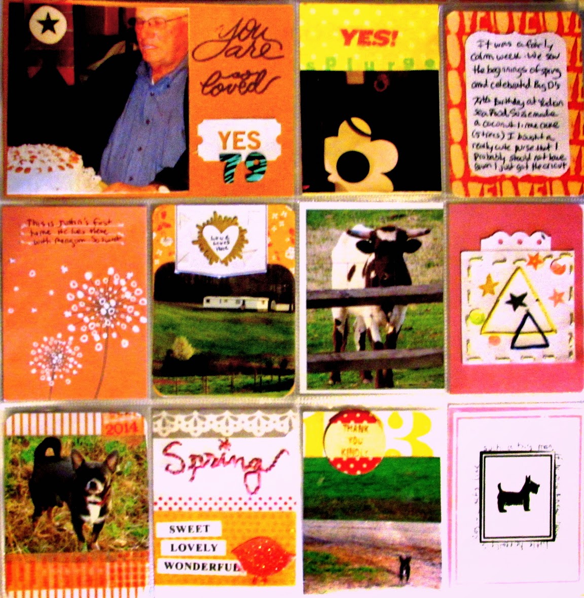
Hello Scrappin' friends!  This week Stuck on U Sketches has a Project Life Challenge where you are to use stamps on your Project Life page.  I decided to use week 13 because I have horrible luck with stamping, though I am trying to get better at it.  Here is my project:
We celebrated my DFIL's 79th birthday that week.  It was a quiet gathering at his favorite local restaurant, so I limited the attention to one card, but the biggest on the page.  I also wanted to celebrate the signs of Spring that I saw. My little tiny dog Roscoe finally wanting to get outdoors gain, new cows, and flowers. I also wanted to document my purse splurge. There is so little I see in stores that I feel I have to have anymore (Unless it is Scrappy) that I had to show off my new purse.  I saw it and fell in love right away. (Got it t Cato's by the way for those who also like it)  I used a lot of stitching on the page, for I am finding that gives great texture without bulk.  I had a lot of fun with these colors too.  I was definitely was feeling the warmth the new Season has brought us that week.

Sunday, April 13, 2014

Quiet Moments

I loved the graphic design work taught on the Studio Calico blog this week and decided to try my hand at what they had done.  I was going to post the link, but it is gone. SC is a site that you better grab it when you see it. Things go in and out fast there, which, I guess is why I like it so much.  I am hooked.  Made this layout of my sweet pup, Roscoe.
I made the paper using a digital stamp on the SC site.  I then stitched the word, moments and used cork letters for the word Quiet, to give the color scheme more balance between the dark blue and other brighter colors.  I cut the corner with my cricut and clustered a few things on the blue tag which matched the thread I used for the stitching  to give the page some more movement.  I stamped the border around the page to make it look more like a frame.  I randomly placed bits of washi tape in pink and borded the sides in yellow to pull from the colors on the top and bottom of the background, again to get that eye moving over the page.I typed the sentiment on the left on my computer and printed it when I printed the background.. My Roscoe...such a sweet boy,.

Saturday, April 12, 2014

End of School Days

I tried my hand at Mixed Media.  I am taking this month's class at Studio Calico and am finding out how fun getting messy is.  I loved this pic of my DD and how she really looks all grown up as she is about to graduate from College.
.The picture I grabbed off of Facebook was really yellow. I had to do some edits to tone it back to natural, but kept the red and yellow theme of the dresses.  I matted the paper in Matte Medium and then spread Gesso over it when it had dried.  I then used the radial Studio Calico stencil and filled that with Gesso a well., letting it dry over night. I then just put spots of red and yellow all over the paper and spread it with water. Edging it in Teal to match the title.  I took a strip of Studio Calico text paper and colored in the icons and highlghted the phrase in yellow water paint.  I cut the doily with my Cricut and added some cork board embellishments to pull the colors together.  I then did a little stitching over the heart, the doily and the top of the picture in a bold grey to give the design more lift.  I made a banner out of washi tape in all of the colors to raise the overall design to the top and counterbalance the red. Looking  at the photo now, I think less embellishment would have been better.  Oh well, I am just learning.

Enjoy your day!

Tuesday, April 8, 2014

Easter Greetings!

I am having great fun with the Cricut Explore.  Making cards has never gone so fast, now that I can print,score and cut in one sweep.  I made this Easter card in less than thirty minutes, including printing the papers from the Echo Park's Digital Papers.  Design time was about another half hour.

I used the Martha Stewart Hydrangea punch, lace, and Studio Calico's Enamel dots to embellish.  the papers were printed from Echo Park's Victoria Garden and Sweet Girl digital lines.


Saturday, April 5, 2014

Stuck on U Sketch Project Life ChallengeYou Warm My Heart

I made this for the Stuck On U Sketches blog, but must have missed my deadline. I thought it was next week.  Had a lot going on this week.  This was the Project Life Spread I made for this week.  The theme was to use the top note shape.  I chose to use the negative space and make it a frame for my fishing family.
This is the first full week that it felt like spring. We have green grass, blooming trees, and the lighting outside is cheery.  I was too busy to take pictures, so I made up for space with embellishments.  I am taking the Studio Calico Stitched class and used the class templates on a few of them.  I never knew how relaxing it would be, and will probably make oodles while watching The Voice each week. The inks and embellishments are from Studio Calico as well. I cut the cut files with my new Cricut Explore.  Gotta tell you, I am loving that thing!  Cricut has won back my heart, now that I can cut SVG files and they fine tuned their ability to cut intricate designs.

Monday, March 24, 2014

Stuck on U Sketches PL Challenge Reveal: My Today

Stuck on U Sketches has a challenge this week with one of my favorite things...Butterflies.  With Spring so close, it was fun to use these in a layout where it actually seemed appropriate.

My brother made a quick trip down here from Ohio this weekend. What a treat!  My niece's boyfriend found a truck for him after months of looking.  Vehicles down here don't rust like they do up there.  I couldn't wait to get the pictures in my PL book.  The weather was in the 70's here, which was a real treat for him.  We actually had a cookout.
I wanted to use Spring colors to reflect the weather we were having that week. Of course, two days later it was back in the 20's, but for that brief moment we had a taste of spring.  I used Studio Calico Cards and Becky Higgins, Honey PL cards.  I also used Studio Calico Stamps and the title was cut on my Silhouette, as was the main butterfly, on the lower left and the die cut on top of the card that was above the main one.
I had to journal sideways, but I kind of liked the movement on the page. I opted to place a butterfly parallel to the writing to emphasize that movement.  The flowers were cut with my i-Top punches. (Cheating I know) I popped them up, and gave them sequin centers.  The blue flower was made using my glue gun and Modge Podge Molds and Glue sticks, then painted with acrylic paint.
I made the butterfly by printing small floral motifs within the cut area before cutting it out on my Silhouette.  I then glittered the dickens out of it across the entire surface. I added the dots in the middle for the body.  I really liked how they turned out.  The same effect can be made with small stamps colored in. You may see more of this from me. 


Friday, March 21, 2014

Stuck on U Sketches Die Cut Reveal: Word Play - You Are...

This week, Stuck on U Sketches has a really fun challenge.  Wordplay is the theme.  There are a zillion things you can do with this, but since this was a die cut challenge, I opted to cut out an entire 8.5 x 11" page on my Silhouette SD.  I used Studio Calico's Office Hours Digital Cut File Set by Page Evans.
I first placed the die cut on an entire page of green card stock.  But it was too dark for the style I was going for.  I ended up cutting it as a border around the die cut and placed it on white paper to brighten things up.

Hand writing in paint and tilted papers and embellies are not my usual style, but I thought I would try something different to make this single face photo more interesting.  I used my modge podge molds I made a few weeks ago and  some Prima Flower centers to put in the middle of them.  I cut the wonky circle rings using to sizes of circle punches then tied them together with ribbon.  I put another circle behind the bottom one to give the bottom more weight to counter the heaviness on the upper left.  I used Gauche paints to make splatters and to give the book page its blue-ness,  Then I put splatters of the paint colors and green sequins to give it more interest.  The banner and tab are from Studio Calico Digital files. I definitely achieved the different than my usual look with this one and you know what?  I like it.  

Thursday, March 20, 2014

Pinterest Inspiration for Color

I am taking a class at Studio Calico that takes sketches to a whole new level.  I was going through Pinterest and found a lot of photos with color combinations that I just loved.  It was an assignment we had in the Color Theory Class at Studio Calico.  This is the combination I used for my latest scrap...


The following was used in the layout":

Martha Stewart Heart punch
Two Peas Heart Feather's die cuts
Studio Calico Free Journal Card
Studio Calico Wood Speech Bubble
Making Memories Sticker
Studio Calico Jubilee Stamp SET
My Mind's Eye, The Sweetest Thing Washi Tape
Water Color Paints in Pink and Blue, each mixed with white and lots of water

Monday, March 10, 2014

Stuck on U Sketches Project Life Challenge" I Love This City

This week, Stuck on U Sketches has a challenge where we are to use neon on our project life page.  I really am not a fan of neon, but got the same effect by using VERY bright colors on black.  I took a tour of a town that is only 10 minutes from me today and found things I never knew were  there. I focused my photos on the downtown district and the pretty and fun things I found.  There was a train track behind the shops on Main Street, a yarn shop where I can take knitting classes (oh boy!),. and a lot of antique and primitive décor shops which are perfect for a our log cabin.  It was a quite a find for something I passed at least once a week.  I will go back often I think.
I used the cut files I got when signing up for classes at Studio Calico, Life Scripted (January's Class)and Stitched.(April's class). I also used their Process Files die cuts to make the tabs for the photos on the left.  This was a fun project because I knew what I wanted to scrap before I left, and which vertical and horizontal shots I needed.  There is a lot to be said for Project Life Planning.  I have taken a lot of pictures in  a week and the ones I wanted to use, did not always fit the pocket pages, so I had to crop more than I wanted. Lesson learned.

Head over to the Stuck on U Skecthes Blog to see what the other designers have come up with for this challenge.  It will surely brighten your day!

Sunday, March 9, 2014

This Calls for Cake and Candles

My niece went to Ohio to surprise my brother and nephew for their Birthdays.  Ruby, her dog is really fitting in with the family. I just loved the photo of her waiting for my brother to come home so the party could begin.
I made this using a combination of stamps and cut files.  The stamps are from Studio Calico and the papers are too.  I am finding stamping backgrounds on paper and then cutting shapes from them can be quite handy when you are trying to unify a page.  SC has matching inks to their papers which make it really easy to pull designs together.  I also used the sewing template for the Love This card from the class kit I got with the Stitching class that Studio Calico will be having in April.  Sewing really adds interest and texture to a page and incorporates colors in a non-invasive way.  The butterfly was made using a Silhouette cut file where I had put digital images of flowers on the wings and  removed the cut function, so they would just be printed on the wings. I then coated the entire bug in white glitter.  It is really pretty up close. This one was really fun to put together!

Friday, March 7, 2014

Stuck on U Sketches Die Cut Challenge: House

Hello all. This week Stuck on U Sketches has a die cut challenge where we are to use a house die cut on our project.  I made a housewarming card. I never seem to have those when I need them.


I used a Silhouette Studio cut file to make the houses. The background was made using a blue rectangle and I stamped white clouds using the Studio Calico Copper Mountain Card digital stamp set.  I added a pinked cut border at the bottom of the houses, and used a digital paper that I had in my silhouette stash to make the swirly effect at the bottom.

Sunday, March 2, 2014

Studio Calico Class Kit

Tomorrow begins Studio Calico's class called Color Theory.  I am so excited. Our first assignment was to find a color combo on line that we liked and create a kit out of it. Here was what I have come up with so far, for mine.