Monday, February 24, 2014

Stuck on U Sketches Project Life Challenge: Envelope with Card

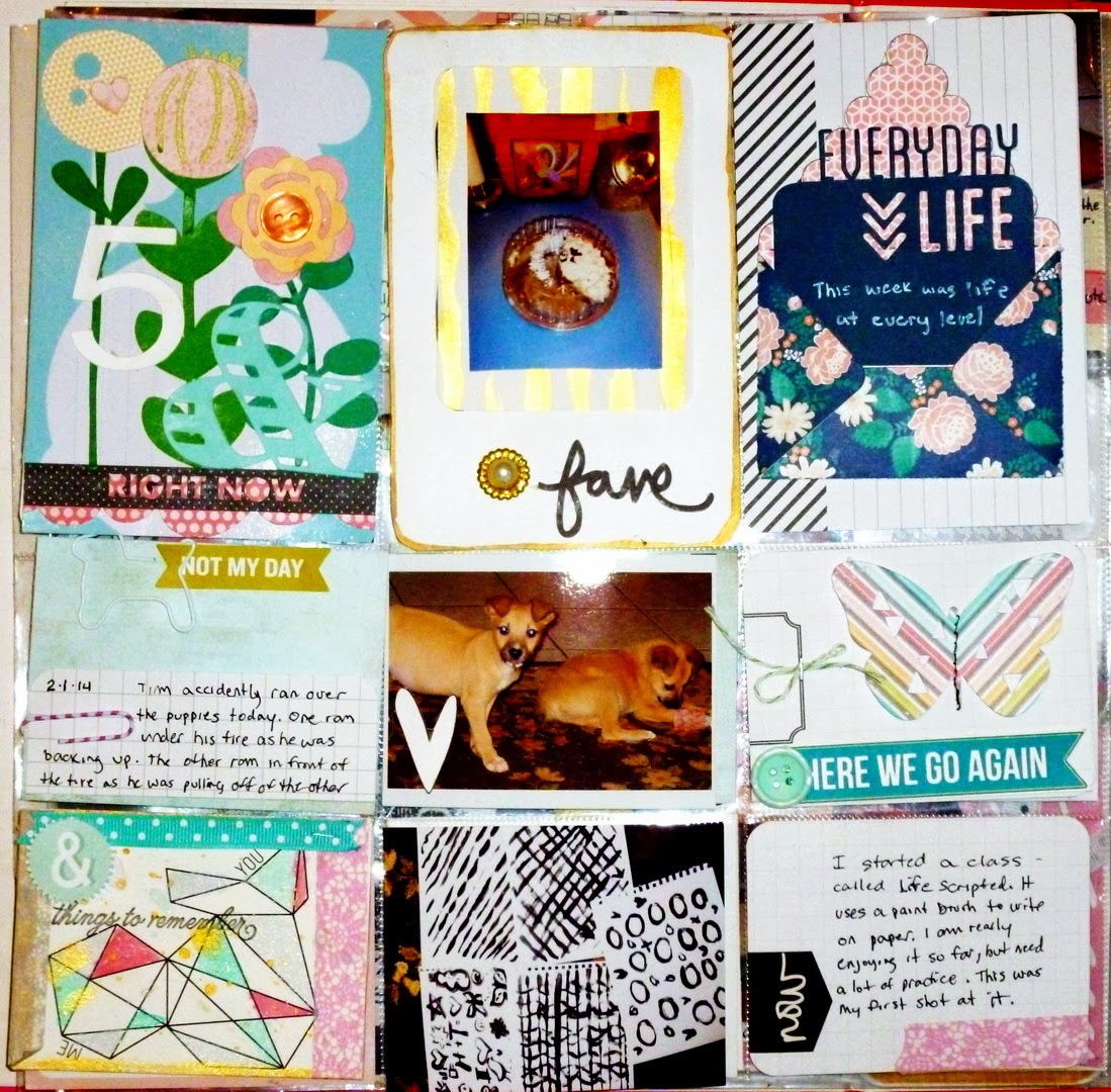
This week's challenge at Stuck on U Sketches is to create a Project Life Layout using an envelope with a card.  I used a combination of Studio Calico and Silhouette Designs to commemorate Week 5 of my book,  It was another sad week for us because my husband ran over both of our puppies.  One of them came to the door the next day totally freaking me out, but he died the next day.  They were such happy little fellas I decided to use happy colors.  We will really miss Oscar and Marvin.  I started a Life Scripted class where you paint words and designs on paper. 
I used the Calico Studio cut file for the envelope and then made the card using a Silhouette file. I opted use some of my practice/learning sheets as part of my page.  The abstract design on the bottom left came from the Blue Note Project Life kit from Studio Calico.  You can barely see the white "dog" paper clip on my journal card about the puppies, but I got those at Staples.  The flowers for the Week 5 Title card came from a cut file at Studio Calico as well.   The gold and pearl circle beside the word 5 is actually a button that I cut the eye off of in the back.  I am really having fun getting creative with flat and small surfaces. If you haven't given project life a try you may be missing something really fun for you too.
 
Head over to the Stuck on U Sketches blog and see what the other designers have done for this challenge. You will probably find your inspiration too.
 

Saturday, February 22, 2014

2 Quick Cards Made Today

I don't have  much time to post details but I wanted to get these posted....

Felt like making  a Romantic Cluster..Might be a Journal cover or a card.  Used the new Modge Podge Glue Sticks and Mold to make the frame and the droplets up top.  Mary Mary Mist, Gold Heart and gold tipped leaves by Studio Calico.. Feather is a digital die cut found at 2 Peas

 This is my Stepson's Birthday Card.  This was made using the Studio Calico Sugar Rush Digital Stampset for Cards. The background paper is Echo Park's Happy Days paper..

NOW OFF TO THE PARTY!!

Friday, February 21, 2014

Stuck on U Sketches Die Cut Challenge Reveal: Umbrella


This week, Stuck on U Sketches has a die cut challenge where we are to use an Umbrella in our design.  The only time I have liked umbrellas was when I was walking under one in the rain. Other than that I think they can rather be a nuisance.  For me they are always getting lost, elsewhere when it is raining, flipping up in the wind, or tearing.  But with rain they are wonderful.  Given this sentiment toward the accessory, I decided to make a sympathy card with one. 
I tend to keep sympathy cards plain.  I don't think lavish embellishment is going to make anyone feel better than a simply stated feeling of condolence.  So, when making one, the elements or design need to pop.  I started with highly contrasting colors.  One can't get any more contrasting than black and white, so I started there.  To add pop of color I used the Hello There pink patterned paper by Carta Bella.  I cut the Silhouette die cut girl out and then glued and sprinkled her with glitter to give the card less of an austere look,  The frame is also a silhouette cut.  I used the Carta Bella Wildflower wood  grain look pattern to give the frame an antique wood look.  The black background paper was from a pattern that I had in my Silhouette software, but I am not sure who made it.  I pop dotted the pink oval and the girl on top of that to give the card some dimension. The sentiment was stamped with a Technique Tuesday stamp I have had for a while now. (so long, it is now yellow)

Head over to the Stuck On U Sketches blog to see what the other designers came up with for this challenge. You might just find some inspiration for a rainy day.

Monday, February 10, 2014

Stuck on U Sketches Project Life Challenge: Insta Capture: Heart Cut Outs

Stuck on U Sketches has a Project Life Challenge this week, where we are to use cut out hearts on our page.  I love to use negative space when die cutting so this one was right up my alley.  This is actually my page 2 of week 2. 

I wanted to relay my Sister in Laws' birthday party, and even used the topper from their cake as the Happy Birthday sign.  I also put a resolution in where I am going to make better bows on my cards using brighter ribbons and a new toy, the Bow it All  by Zutter.  Lastly was the fact that I started to bond with my Hubbie's new puppies, though I said I wouldn't. I let them in the house when we went into single digit temps here in Carolina.  They sure enjoyed playing in my scrap room, which needed vacuuming anyway...lol.


Three rows make 3 stories on one page. I love it!
I have recently discovered Studio Calico's Project Life kits.  Their site offers a  mixture of kits, paper, printouts, die cuts, stamps (digital and physical)  tools and they even have a class on Project Life that I am taking.  One of their digital files is the heart cutout that you in the second row. Using the negative space,  I backed the heart holes with American Craft's "Sweetest Thing" washi tape, sticky side up and then sprinkled them with white glitter, to give them a more frosty winter look.
I am learning that paper Project Life is a lot different than paper scrapping or even Digital Project Life.  It is like scrapping but every pocket is it's own page including the pictures. It will take some practice to make all of those mini pages blend together well into one unified page.  I opted to use color for this layout to give it more unity, but there are more tricks to come as you will see in my future pages.  I figured I should share what I learn, because there is so little out there on the web for PL other than examples without descriptions of methods.  It is an art to make flat pages have texture and dimension, and I am up to the challenge.
 
I think I am really going to like the paper version projects a lot better than digital because it stretches your creativity more when you have more three dimensional and textures to choose from.  I am doing something different this year.  I am not going to force myself to come up with a whole page if I don't have a whole page of content each week. It will relieve some of the pressure and I sort of like how the weeks sort of flow together as they do in real life. 
 
Head over to the Stuck on U Sketches blog and see what the other designers did with this challenge.  The talents of this team are limitless!


Friday, February 7, 2014

SOU Sketches Die Cut Challenge Reveal: Sweet

Hello all!  This week Stuck on U Sketches has a die cut challenge where we are to make something sweet. 

I fell in love with this cupcake die cut from Studio Calico.  The set also comes with an ice cream cone.  I made this little card for my daughter for Valentine's day.  I really do think she is swell.

I die cut the set on my Silhouette using the color feature to create the colors I wanted.  The background paper is from a digital paper set I bought long ago before I labeled them. The arrow heart is a Silhouette die cut.  The font I used to cut the title on my Silhouette is by Lori Whitlock and called LW Friendly.  I dabbed a bit of glue and pink glitter on the icing and heart on the cupcake to give the card more sparkle. 


Well with Valentines Day only being a week away, what is better than Kisses.
 
I used the Lots of Kisses Printable Set by The Cutting Cafe'. This set is title appropriately. There are tons of color selections and sentiments to go with it.   Regina even provides you with the little paper sentiments to put at the top of the kiss.  I had a hard time making a choice.  I punched gold hearts using an old punch I have by EK Success.  I made a little bow and glued it underneath the kiss on the bottom grounding border to add  a little more sweetness. 

Head over tot he Stuck on U Sketches blog to see what other sweet goodies were created.

Sunday, February 2, 2014

Studio Calico Stamp / Cut files

Studio Calico has a great website.  They have a different style than I am used to, but I have trying to update my looks. This site has tons of ideas in their galleries, classes and forums to help me learn how to do just what I want to do. I have downloaded their card making files. In fact, I have gotten almost all of the digital files.  Here are two cards that I have made so far....fun, fun, fun!
Copper Mountain Card Making Stamp Set

Sugar Rush Card Making Stamp Set
 
I used Photoshop Elements and my Silhouette Design Studio to create, color and cut the cut files.  I love the fact that they have themes each month.  The designs are fairly generic, but they have sentiments that can go with special events.  I am really enjoying this site. They have a wide selection each month, but they only keep the inventory for a short while before they sell out.  The digital files only last for two months.  So if you are looking something fresh to go to for scrappy goodness, you may want to check out Studio Calico.